

TidyTeddy UI & Branding
March 3, 2016
Monash Education Academy Brand and Communications System
August 20, 2025
CupCompass is where flavour meets adventure.
This is a coffee brand made for the curious — people who collect memories, not just mugs. Every blend is inspired by a real place, and every sip tells a little story of its own. From Bali’s coconut mornings to berry-kissed sunsets in Vancouver, CupCompass lets you taste your way around the world.
Brew with Delight. Gift with meaning.
We don’t do ordinary.
Each CupCompass flavour captures the mood of a city, translated into colour, aroma, and design.
Our packaging is bold, gift-ready, and full of personality.
Whether you’re starting your day or surprising a friend, our eco-friendly cups carry more than coffee — they carry a piece of somewhere else.
This is coffee with a compass.
Made to travel. Made to share. Made to feel.

1
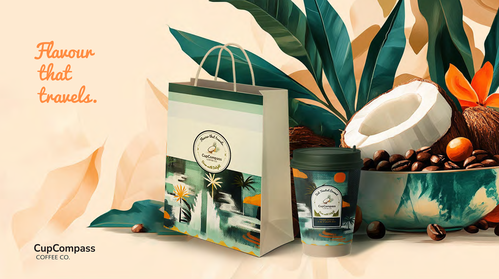
Bali: Gentle Layers of Nature
The Bali moodboard focuses on minimalist tropical illustration, with layered rice fields, temple gates, and silhouettes bathed in pastel gradients. Imagery is atmospheric and open — soft skies, slow swings, distant volcanoes.
This tranquil composition uses earthy greens, sunlit beige, and teal shadows, echoing the mellow, grounded vibe of Toasted Coconut. It feels slow, serene, and softly immersive.
2
Vancouver: Bright, Tart, Expressive
Illustrations here lean into high-saturation contrasts and organic textures. From hand-drawn berries to stylized mountain skylines, the visuals blend nature with city life. It’s bold yet cozy — full of character.
The colour palette — deep purples, berry reds, icy blues — is lively and tart, like a juicy bite. This boldness directly connects to the Berry Infusion flavour: tangy, fresh, and a little wild.


3
Barcelona: Warm, Bold, Coastal
Retro travel posters and stylized street views set the tone — bold outlines, long shadows, and golden light. The palette of peach, coral, sea blue, and caramel evokes late afternoons by the sea.
This mood directly informs the Caramel Sea Salt flavour: sweet with a bold, salty edge.
4
Typeface Selection
Some letters lean back. Some lean in.
Like people in a café — fonts, too, have personality.
Bali flows in Pacifico, like waves curling under coconut palms — soft, relaxed, and island-sweet.
Vancouver bursts with Vigrand Bold Rough, a juicy, hand-inked punch that echoes its berry tang and forest energy.
Barcelona Caramel Sea Salt features The Blacklist, a dramatic, handwritten style that captures the bold flair of the city.
Beneath all the stories, Ebrima walks in straight lines — a grounded sans-serif that lets each city shine, while keeping the brand anchored.


5
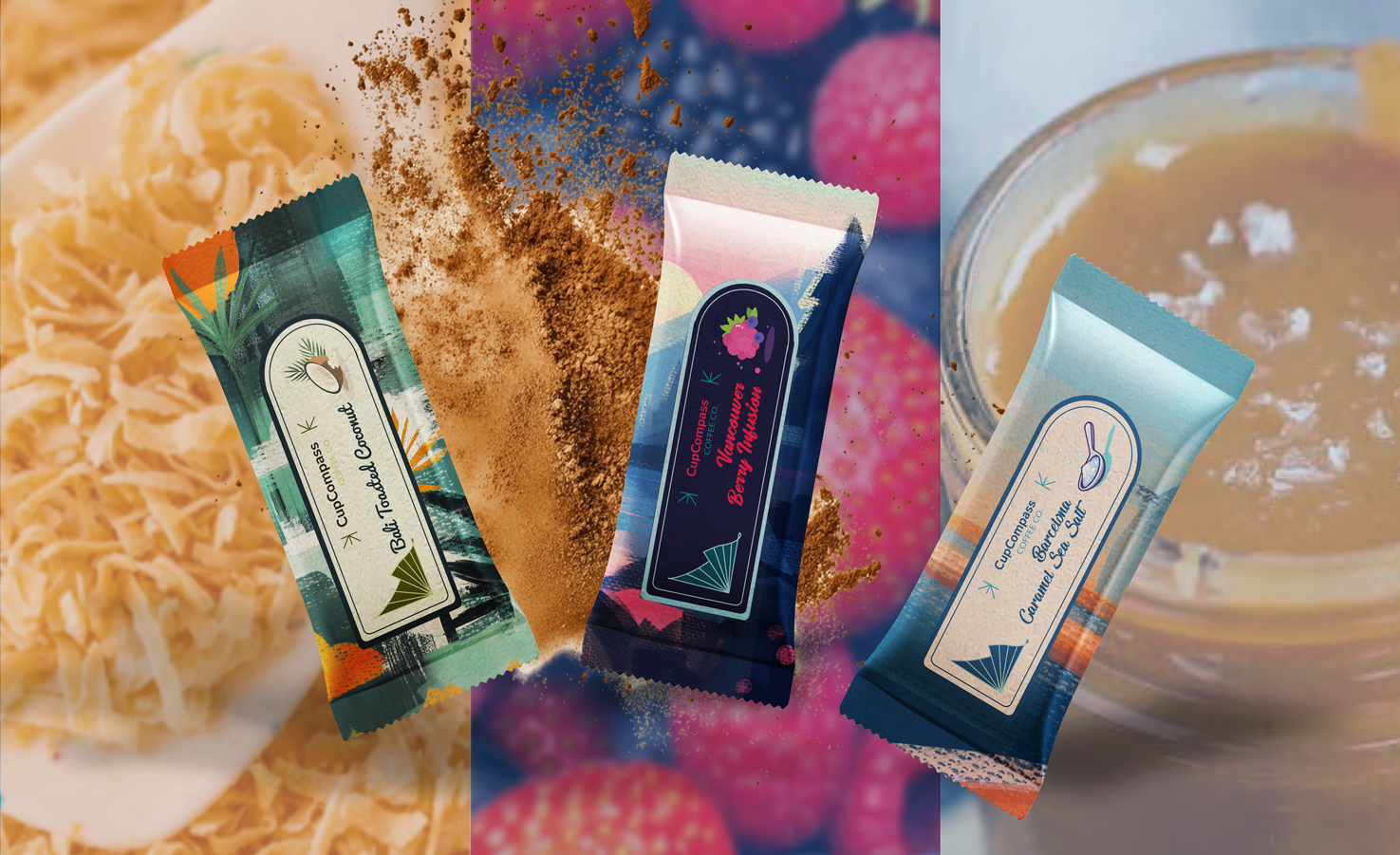
Flavour Logomarks
Each label is a window into a city’s spirit. In this journey of design, the labels are like postcards from faraway cities:
Each label feels like a stop on the map — a sip of coconut warmth, a flash of tart berry, a breeze of salted caramel air.
Not just flavours, but fragments of cities, carried in colour, shape, and taste.
6
Refinement
Each illustration begins not with a map, but with a feeling. Sunlight slanting across a quiet shore, tropical air thick with green, the hush before a mountain sunrise—these aren’t literal scenes, but visual impressions. They're meant to spark recognition in the heart before the mind.
The flat composition and painterly textures echo the casual rhythm of travel. Colors are drawn from the flavors themselves—salty blues, berry pinks, coconut greens—then pushed further with surprising brights that break the palette in just the right way. This contrast adds energy, like a twist of citrus or a sudden breeze through an open window.
Finished with a relaxed oilcloth-like texture, the illustrations feel lived-in and tactile—something you'd find on a sun-faded journal or a favorite travel bag. They're not just decorative—they invite you into the world CupCompass brews from.


Style Exploration
These cups don’t speak in polished whispers, nor do they shout in color. Instead, they settle into something quieter—like a flavor caught in a daydream.
Each cup feels like the beginning of a story, shaped by the light and air of somewhere else. A taste that carries a place with it: its colors, its rhythms, even the scent that might hang in the morning.


From Wild to Defined
They don’t match—not exactly. But they hum the same tune: a compass rose, a curved silhouette, a whisper of gift-giving.
Each cup feels like a fleeting story: a taste, a place, a mood.
Together, they travel. Separately, they surprise.
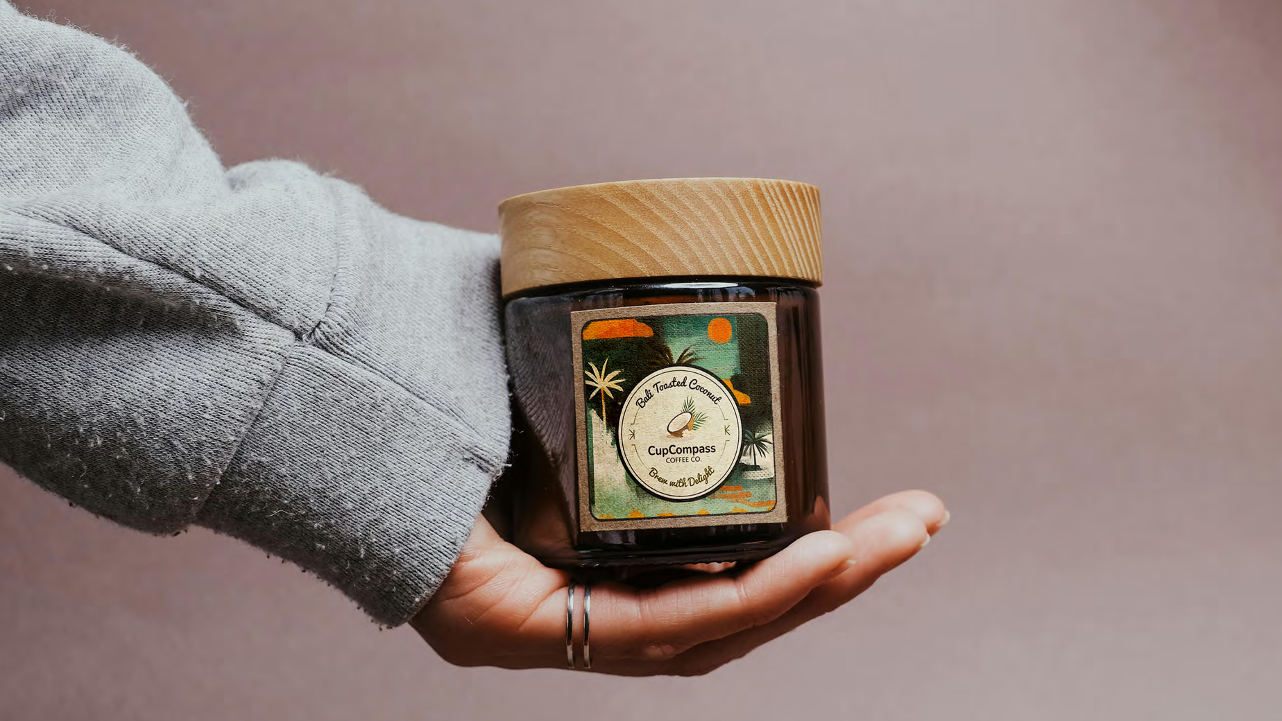
And the journey doesn’t stop at the cup.
It spills into bags, bars, and jars—objects of delight that carry the same rhythm.
A wrapped bar tucked in your tote. A jar resting in your palm.
The scent of roasted coconut rising from a ribboned box.
Each design holds just enough to make you curious, never too much to explain.
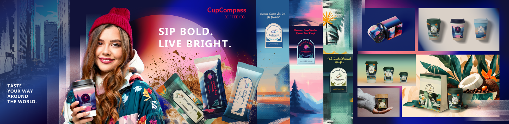
Brand Worldbuilding That Travels
Bright, bold, and built to be remembered — this brand world is made to stand out on shelves and in minds.
This stylescape ties together everything the brand touches — from street-ready attitude to shelf presence. It captures the energy of a flavor-led identity: punchy but polished, playful yet grounded. Every visual cue — color, type, texture, form — helps position CupCompass not just as a coffee brand, but as a travel-inspired moodboard ready to live across retail, digital, and lifestyle moments.

A Souvenir in Ceramics
The Vancouver Berry variant was modeled and rendered as a gift set to explore how flavor-driven storytelling can extend across materials and surfaces.
The curved mug and boxed canvas translate the illustration into an object with presence — something that feels collectible, tactile, and true to the CupCompass voice.
Unbox the moment.
A quick look at the CupCompass mug set in motion, turning a quiet evening into a taste of elsewhere.
To expand the CupCompass experience beyond packaging, I created a series of 3D animated visuals featuring the Vancouver Berry blend. From the unboxing of the gift set to product-in-context scenes, these clips highlight how flavor and story can live in space and light.
Rendered in Blender, the animations were crafted for both wide-screen presentation and mobile-first formats, designed to suit everything from campaign teasers to social media moments.