

Life on the Ice Edge
March 3, 2016
Not every path needs a guide.
Some just need a trail—quiet, clear, a few steps ahead.
Nextin connects tech professionals with mentors—1-on-1, no bundles, no noise.
Real people, meeting with purpose.
I redesigned the mentor-side experience to reflect that.
Sign-up shouldn’t push. It should pace you.
Tagging shouldn’t label. It should reveal depth.
Booking shouldn’t rush. It should respect time.
Even the words changed—less pitch, more invitation.
This wasn’t about polish.
It was about control, clarity, and a design that moves when you do.
First Build, Brand First

Not every useful pattern is the right one.
Nextin is built for moments of transition—when tech professionals seek direction, not noise. It connects them with mentors who’ve been there, and are ready to talk.
We don’t chase funnels or conversion tricks.
We design for trust, clarity, and dialogue with intent.
From 0 to launch, I led the design of key experience modules—mentor onboarding, the tagging system, and the session booking flow.
My focus was always the same: design for intent, not pressure. Every sentence, every step, had to earn user trust.
Slow is a choice.
No pop-ups. No countdowns. No urgent banners.
We avoided pushy UI cues and high-pressure patterns.
The flow doesn’t rush or interrupt—it invites.
We slowed the experience on purpose, to build something deeper: trust.
People, not profiles.
No ratings. No “most booked” badges. No urgency.
We resisted platform tropes that reduce people to cards and scores.
Mentor pages focus on expertise and experience—not performance metrics.
We guide users to notice what matters, not what’s trending.
Expression over completion.
Tagging isn’t limited to presets—users define their own terms.
Resume and social links are optional, not enforced.
Session setup allows freeform notes, not just dropdowns.
We gave up uniformity to prioritize expressive, contextual input.
Define the Path: Registration Flow

Purpose of the Flow
We weren't collecting data—we were building trust. Each question in the mentor registration served structural purposes:
- To capture a clear professional identity
- To support future matching & profile display
- To lower user cognitive load when selecting mentors

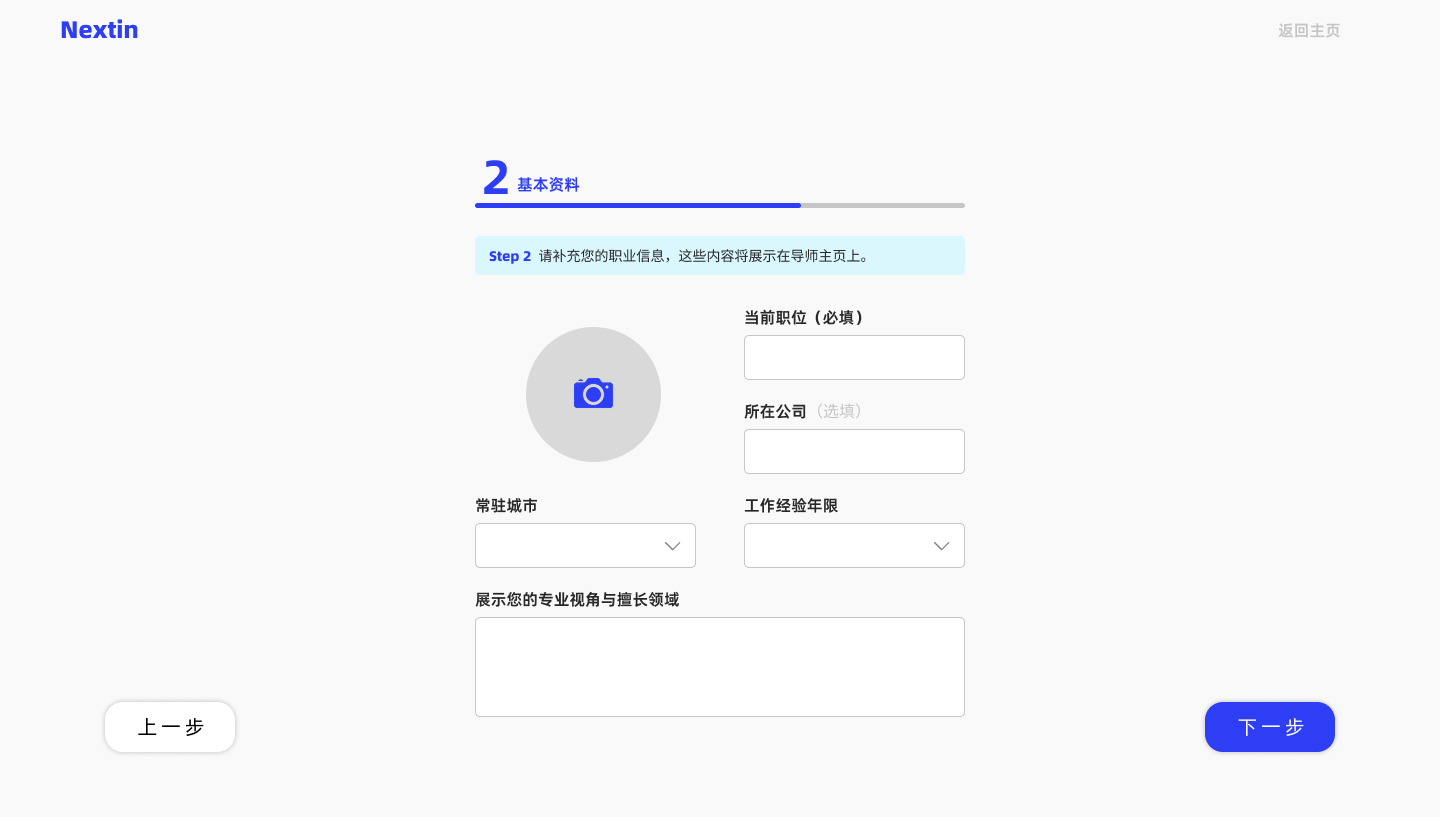
Basic Info
To build identity anchors. We focused only on the most essential fields to establish trust:
- Photo – First impression, credibility anchor
- Position + Company – Industry lens, system-tagged for visibility
- Location + Experience – For groundedness, ordering, and mentor-user resonance
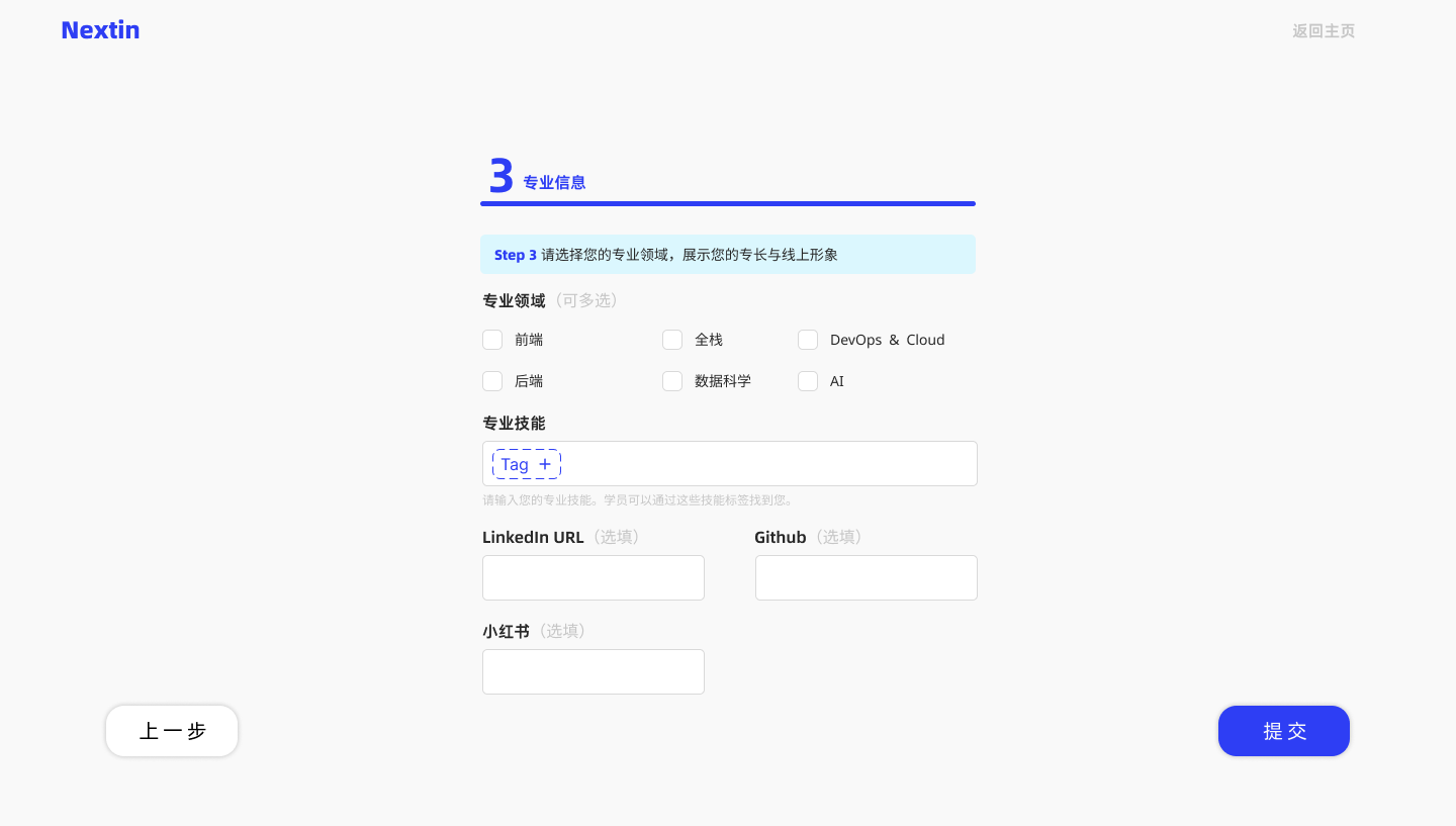
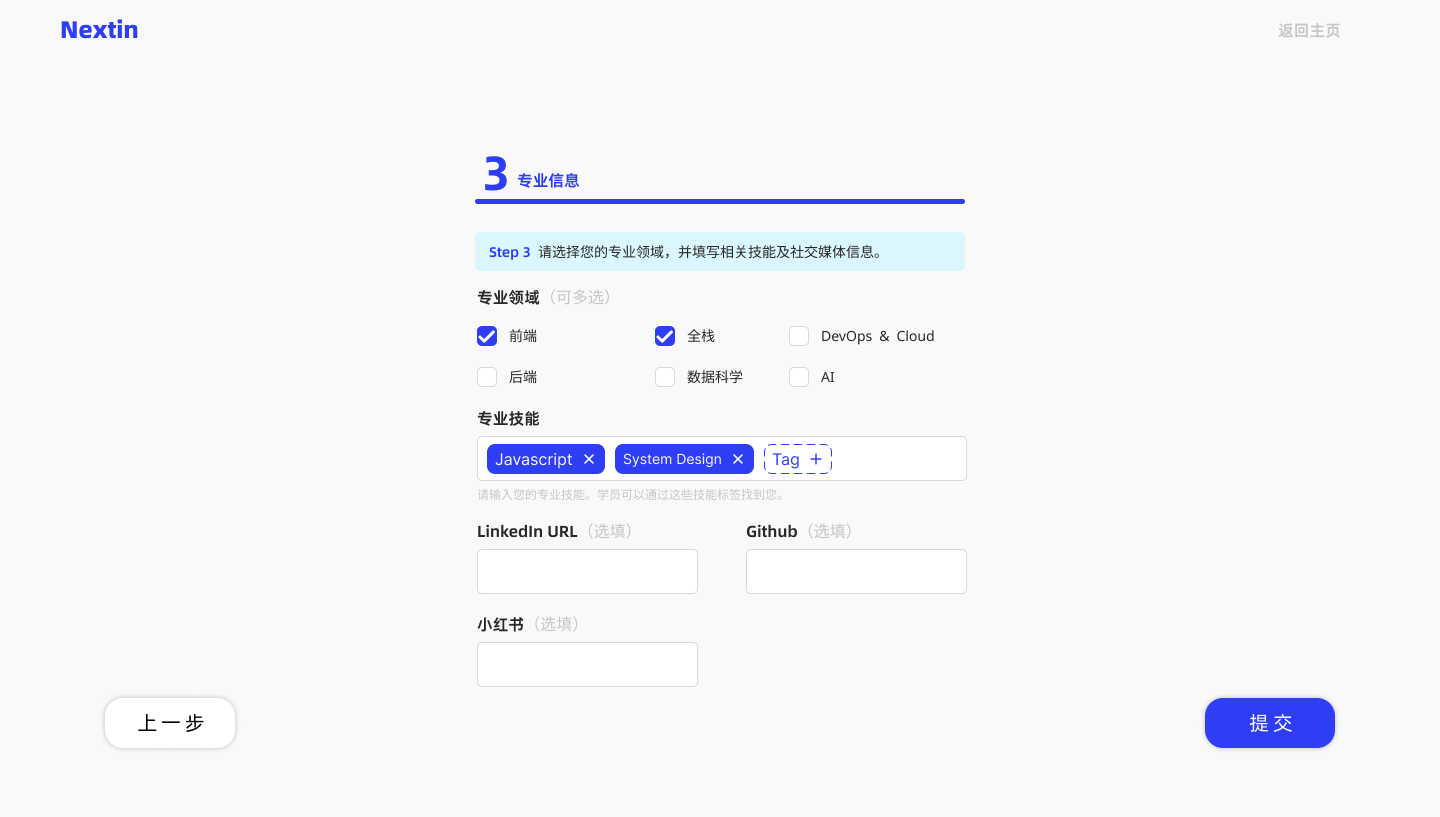

Domain Profile
Build the mentor's capability map.
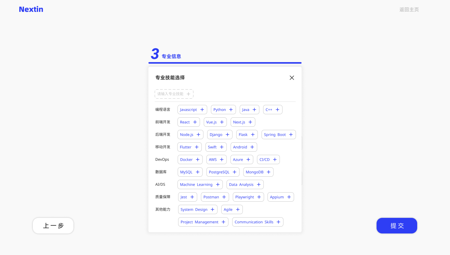
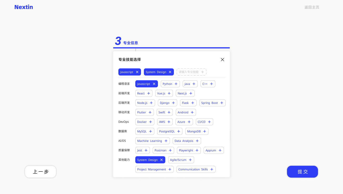
- Domains: Preset fields of expertise
- Skill Tags: User-defined; shown as keywords
- Links: Optional, adds credibility
Recommendation Interface


Purpose & Context
The “Find a Mentor” page is where the decision path begins. It helps users filter with minimal effort and builds trust through structure and clarity.
Establish Trust: Mentor Detail Page

Mentor Overview
This section delivers a quick and confident overview of the mentor.
Core identity anchors include role, industry scope, and years of experience.
The layout emphasizes clarity over decoration — first impressions must be calm, not chaotic.
Service Offerings
Each mentor profile centers around three service tracks:
- Resume Polish (hourly or per-review)
- Mock Interview (1:1 sessions + feedback)
- 1v1 Consultation (career or project advice)
Instead of marketing spin, we structure service data to help users assess fit — by scope, price, and availability.

About the Mentor
This section allows mentors to express their focus, tone, and strengths — in their own words.
We avoid badges or platform “endorsements” to leave room for personal judgment.
Skill Tags & Domains
Skill tags and domain labels are surfaced from the mentor’s self-defined inputs. They feed into the match engine, but also signal range and depth at a glance.

Student Reviews
Student reviews are shown by service type.
This helps users differentiate strengths — not just overall ratings.
We favor clear signal over volume or sentimentality.
Booking Flow


Step 1:
Confirm Details
Users cannot change the core service category here, but can select sub-services (e.g. "Deep Edit"). Services are priced per hour or per session. The UI updates price and duration dynamically.
Step 2:
Pick Time
Users choose a time from the mentor’s available slots and may upload a resume or leave notes to help the mentor prepare in advance.
Student Onboarding

Step 0:
Landing Page
Before registering, students are introduced to our core services and learning philosophy. The layout clarifies the value of personalized mentor support and builds motivation to start the process.

Step 1:
Create an Account
Account creation is simplified into a single form to minimize friction. Fields are optional beyond email and password, encouraging students to start quickly and finish later.

Step 2:
Career Intent
Students specify their target roles, preferred cities, and academic background. This input helps the platform pre-classify users and display tailored mentor suggestions later. Key fields are optional to keep entry low-friction.

Step 3:
Guide Next Action
After signup, students are introduced to all service categories with structured explanations and CTA buttons. This screen links immediately to the “Find a Mentor” page and supports smooth onboarding into real bookings.
Final Notes
A mentor platform is more than a marketplace — it's a decision space.
Every interface in Nextin was designed not to impress, but to inform, guide, and reassure. Trust is earned through structure. Clarity becomes the foundation for action.
What This Project Solves
1
Minimized Entry Friction
From registration to booking, key fields were modular and lightweight — optimized for motivation, not overload.
2
Structured Data Inputs for Matching
Onboarding flows feed directly into recommendation engines through categorized roles, skills, and preferences.
3
Trust-Centered Mentor Profiles
Mentor detail pages were stripped of decorative noise, focusing on what matters for a booking decision: role, service scope, and credibility signals.